The Crest Dissected: Cardiff City FC
It's about time we resurrected one of our most popular series - The Crest Dissected. The reason for such a return is a personal one. As we have seen and read, football crests hold in them words, images and colours which have strong links to their respective club's history. From the Hillsborough flames on Liverpool's to the Eiffel Tower on PSG's - we want to explore how something so simple can become so incredibly powerful. Cardiff City have endured a number of recent changes to their club's crest in the 21st Century and most City fans will be quick to praise the badge which adorned their side's blue kits from 1985-2003 and again from 2008 to 2012. As a personal connection - this crest was designed and created by my own Dad and Grandad.
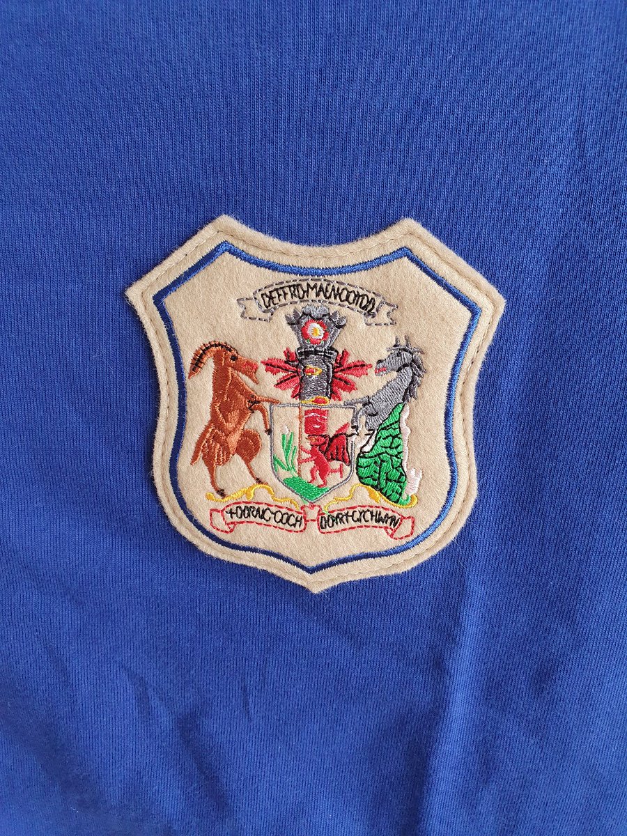
Although commonplace on Cardiff City kits since the 1960s, the club only used a crest sporadically throughout their early history. The 1927 FA Cup Final is perhaps the clearest example of this as City took on Herbert Chapman's Arsenal at Wembley. Winning the tie 1-0, thanks to a Hughie Ferguson goal 16-minutes from time, Fred Keenor would make history, lifting the trophy, as Cardiff became the first, and only, club from outside of England to win the FA Cup. Worn on his blue jersey was a distinct crest featuring a goat, a seahorse and a Welsh Dragon in the centre. Furthermore, as if to amply the Welsh identity with which the club is so proud of, is the daffodil and leeks at the foot of Y Ddraig Coch. The badge had taken its inspiration directly from the City of Cardiff's own coat of arms. Still seen frequently around the Welsh capital today, it use on the shirts of Keenor, Ferguson and co. highlight the club's role in the community. They were representing more than just the club, they were representing the city.

Similar to most clubs, in the immediate years after the Second World War, Cardiff would also perform in plain shirts without a crest. However, the club's kit from 1959-60 suggests that they would occasionaly play with a single bluebird worn proudly on their jerseys. The 1959-60 season would be one to remember as the club earned promotion to the top flight. Edging past Liverpool, who had recently appointed Bill Shankly as manager, the Bluebirds were looking to improve on their last season in the First Division in 1956/57.
Surviving just two seasons in the top-flight, Cardiff were once again relegated in 1962. The Second Division was where the club would remain for 13 years. Following a poor 1974/75, they were once again relelgated, this time to the third tier of English football. For the first time since 1946/47, Cardiff would be outside of the top two divisions. Despite this, the period from 1962-1975 was not all doom and gloom as positive performances in the Welsh Cup would lead to City playing in Europe for the first time. Alongside the changes in fortunes and results, the club's crest would also alter massively.
In 1965, the club adopted it first seemingly permanent crest on the famous blue jerseys. Cardiff's nickname, Bluebirds, was displayed proudly over the heart of the players. The bluebird has become synonymous with the club - mainly in response to the side's blue shirt and white shorts being reminscent of the small bird. Newspaper archives begin to refer the club by its famous nickname around the turn of the 1920s. The nickname became so linked to the team that the Western Mail was even provided with a bluebird from a local taxidermist in 1921! Asking whether they could offer it to the club as a lucky charm, it is clear that the bird was indeed an important symbol of the club's identity.
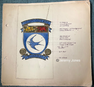
By 1969, the simple word, Bluebirds, was replaced with the instantly recognisable bluebird inside a plain white circle. It was with this basic design, that we are introduced to my Grandfather. Jeff Jones was the Cardiff City club architect from the 1966 until 1973. Despite only being in the role for seven years, his legacy is still widely seen around the club and the city of Cardiff (where he worked for the county council too) today. The simple bluebird badge emblazoned on the shirts was to remain until 1985 but the club's official crest was to be given a new lease of life c.1970. Talking to my Dad, who also played a major role in the crest's design, he offered an intriguing insight into the design process,
"Dad was asked by the chairman of Cardiff at the time if he would design a new badge. Dad came home and told me about it and asked what I thought and if I had anything he could look at. I had a lot of football stuff at the time as I was collecting the football crests and badges because they were being given away free with Esso petrol. Dad and I, on the dining room table, began to sketch out a lot of different ideas"
Looking at the crest now, it is clear that the Bluebird remained at the heart and soul of the club's identity. Keeping its place proudly at the forefront of the badge, the swift nature of the animal reflects the speed and skill of the players on the pitch.
"The Bluebird in the middle was the one that was on the shirts anyway, so that part of it stayed and everything else went around it."
At first glance, the emblem is distinctly Welsh. With a daffodil in the top left and a Welsh Dragon in the top right, the Cardiff City crest would help to reflect the club's national allegiance. Playing in a 'foreign' league, it is with these symbols that perfectly portray a true sense of pride in all things Welsh. What many might not be aware of is that the ferocious Ddraig Coch may not have ended up on the final design...
"An early version didn't have the Welsh Dragon, it had a leek. I think it was to emphasise the Welsh identity and that Cardiff was the capital of Wales. I think the Cardiff City board preferred our design with the Dragon because it was more obviously Welsh."
Completing the design was the name of the club in a ribbon at the top and once again, the club's nickname, displayed proudly at the bottom of the design. It is hear that two footballs stand like sentinels protecting the bluebird. Why the footballs? According to Dad, 'I thought they were pretty neat'! Although not used on the shirts for another decade, the crest would become displayed all around Ninian Park from the early 1970s and used in programmes and club merchandise soon after. Showing me the Cardiff City vs Sunderland match programme from 1973/4, here was the first use of the badge we could find.
As aforementioned, Jeff Jones' influence on Cardiff City is huge. The club's former fortress Ninian Park could thank him for the design of the Grandstand on Sloper Road and the Bluebird's club. In just seven years he had changed the way we see the club forever.
Eventually finding its way onto the jerseys in 1985, the crest would remain until 2003. In its nearly 20 years on the shirts, it saw relegation down to the fourth tier, where Cardiff would finish as low as 22nd in 1996. However, as if given a new lease of life towards the end of the millennium, City would begin their rise back through the divisions. Securing promotions in 2001 and 2003, the Bluebirds would enter the second tier of English for the first time since 1985. Unfortunately for Grandad and Dad, the crest would be redesigned for Cardiff's attempts at reaching the Premier League.
Still enveloped in Welsh identity, the new badge would feature the bluebird once again, but this time flying over a flag of Saint David, the patron saint of Wales. Although maintaining their Championship status with the new crest and reaching the FA Cup Final again in 2008, the following season would see Grandad's design was once again reused as Cardiff's main emblem. Coming within a play-off final defeat to Blackpool of reaching the Premier League, new owner Vincent Tan would have big ideas as to how the club could eventually reach the promised land.
The now infamous rebrand, which saw the club's historic blue and white removed in favour of red and black, also replaced the much-loved crest with a new design. The bluebird was replaced as the badge's protaganist in favour of the Welsh Dragon. Described as a 'radical proposal' its prime aim was to increase investment, particularly from East Asia. The rebrand was to be "a symbolic fusion with Asia which will allow us to fly the Welsh flag on behalf of Cardiff wherever we go". For many, the club was to lose its identity, with the bluebird forever remaining the most important symbol of Cardiff City supporters. Despite the overhaul eventually earning the club millions of pounds in investments and promotion to the top-flight, a instant relegation and off-the-pitch drama meant Cardiff City were at risk of becoming all that modern-day supporters despise about the current footballing climate.
By 2015, the rebrand was put to rest and Cardiff once more embraced the blue and white kits. Proudly displayed on their shirts was another new crest. A fusion of Grandad's design with subtle Asian influences, the bluebird would once more take centre stage, with the dragon placed underneath. Supporters were happy with the changes, commenting, "The future's blue and we don't have to feel as detached from our club any more." Furthermore, despite reverting to the tried and tested blue design, Cardiff would earn promotion to the Premier League again in 2018 under Neil Warnock. Despite relegation back to the Championship, this season (2019-20) sees the Bluebirds one game away from the play-offs. The bluebird may once again be flying high in the top-flight.
Written by Ben Jones (@TFHBs). I would like to thank my Dad for providing me with the images of the original designs and speaking to me about the design process! You can follow him on Twitter @Bassman_Jez
 |
| Dad with his and Grandad's designs |


Comments